
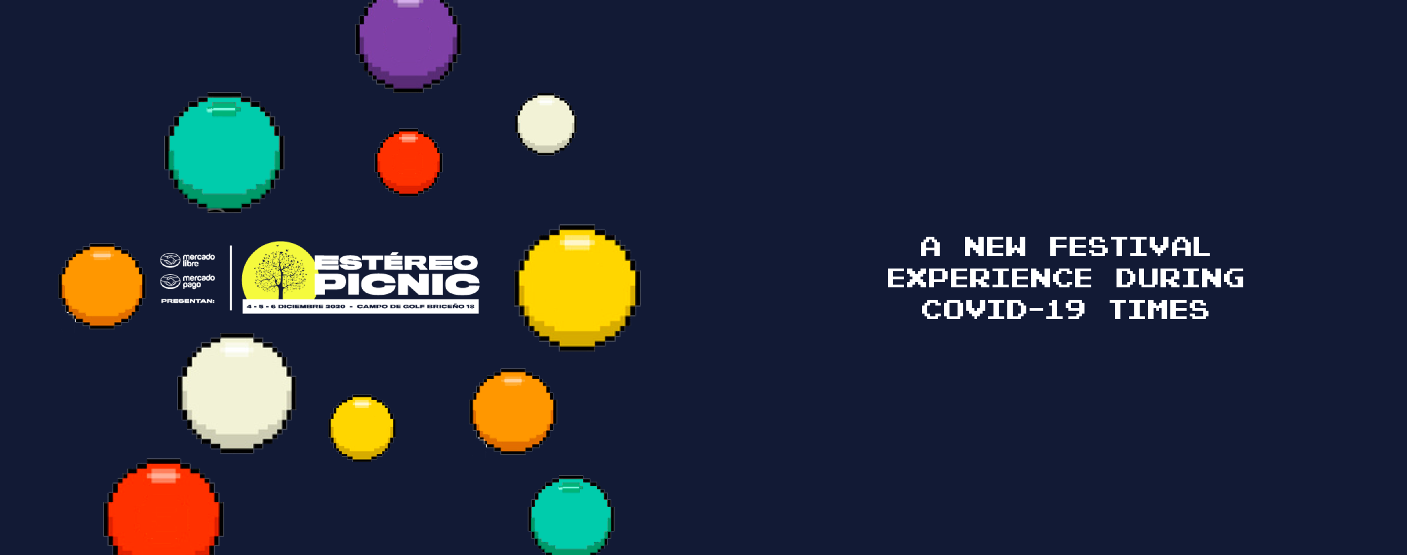
Estereo Picnic Festival —Case Study
A new festival experience during COVID — 19 times
Responsive Design
Mobile First
Summary
· · ·
My role
- UX Researcher/UI Designer.
- Freelancer and fan of the festival.
- Duration: 1 week
Tools
- Milanote: Moodboard.
- Adobe Photoshop: Pixel art.
- Mural: Brainstorming, card sorting, MVP (Moscow diagram), Information Architecture, summarize qualitative research.
- Sketch: Wireframes, user persona template.
- Principle: Hi-Fi animation.
· · ·
Main problem
The Estereo Picnic Festival (Festival Estéreo Picnic in Spanish) is a festival created in Bogota in 2010, which usually happens in the last weeks of March or the beginning of April. In the first edition, they had 2800 spectators but in the last year (2019) they had 87000 spectators, this data shows that this festival is the biggest one in the country. In the festival, you can find different artists from genres such as rock, EDM, pop, salsa, and Vallenato (typical genre from Colombia).
Right now the festival was postponed because of COVID-19 and was moved to the next year. Some of the people that already bought the tickets said that they think that the festival might be canceled because of the restrictions done by that the government that says that all the big events will be canceled until the 31st of December of 2020 or until the virus is controlled.
In this article, I will show you how I designed a possible solution to help the festival organizers to motivate the people that already have the tickets, so they can experience the privileges of having it and help them to give their users a similar festival experience from their houses. I will know this project is a success if more or less of the 50% of the users that purchased the tickets attend to the online event, also I will know that it’s a success if this helps to promote the purchase of more tickets for the event in December.
· · ·
Our User Persona
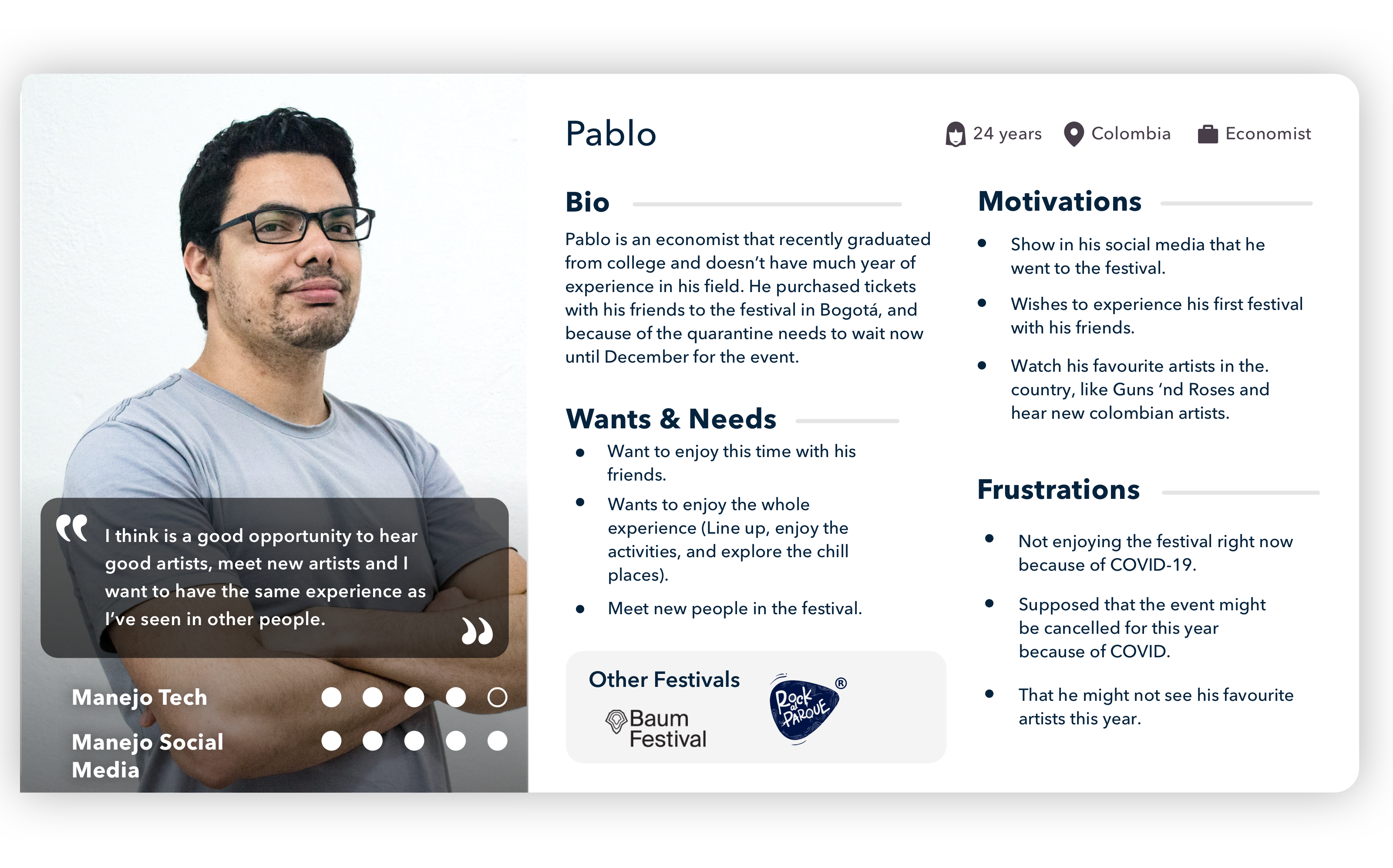
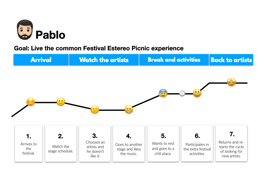
His journey
This is the journey of a user in any of the lasts editions of the festival, as you can see the user can move along the festival in a different experience, and this helps the user to explore different environments.
· · ·
Solution
Based on the results and the user persona, I decided to create a responsive web page for the special online event and after that, another web page will be available after that event until December. After doing a brainstorm of all the possible features that can help the user to have a similar experience online, I used the Moscow Diagram that helped me to choose the “must-have” and the “should have” features on both web pages.
After that, I did the Value vs effort diagram to choose the MVP that can be developed in this phase which helped me to choose the MVP for this project and the solution for this.
The solution is divided into two important web pages:
- The main online event: This web page has features like:
- Chronometer to check how much time is until the main event in December.
- Three different parallel stages where the user can move through, with the. sponsors names.
- Picnic zone where users can watch any of the stages while they have a video call with friends (only for people who purchased the tickets).
- Buy tickets for the event in December (which also gives some privileges in the online event).
- An exclusive stage with content like: exclusive interviews of the lineup for this year, zoom background with iconic places of the festival, exclusive videos from then past versions, access to picnic zone, and send questions to their favorite artists of the lineup.
- Donate for the main NGO that needs support because of COVID.
- Page for after the main online event:
- Chronometer until the main event.
- Same features as the current page like buying tickets, pay for transportation until the event, glamping, etc.
· · ·
Design
Before starting to do the prototype I decided to create a moodboard that gathers all the feelings, colors, and visual guidelines used in the previous editions. If you want to check better the UI, you can access the article in Behance
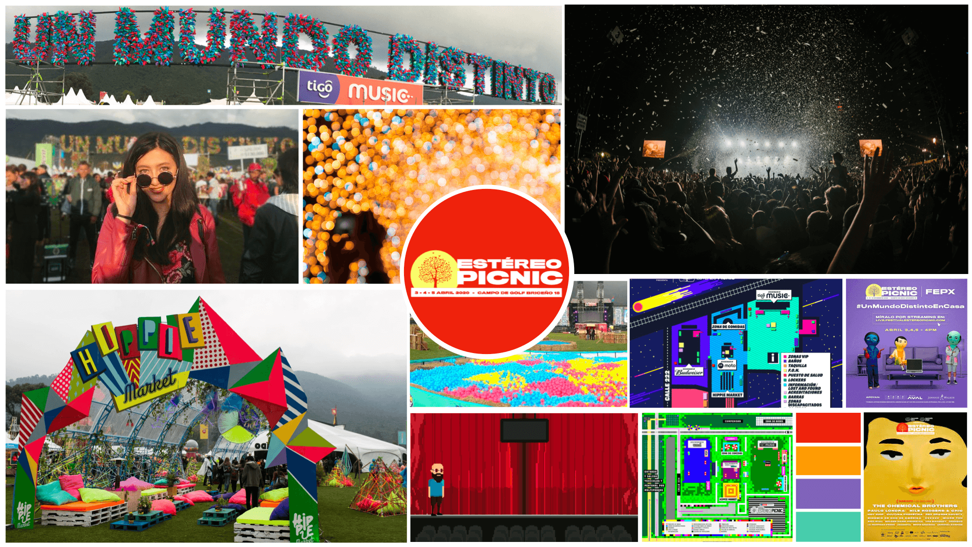
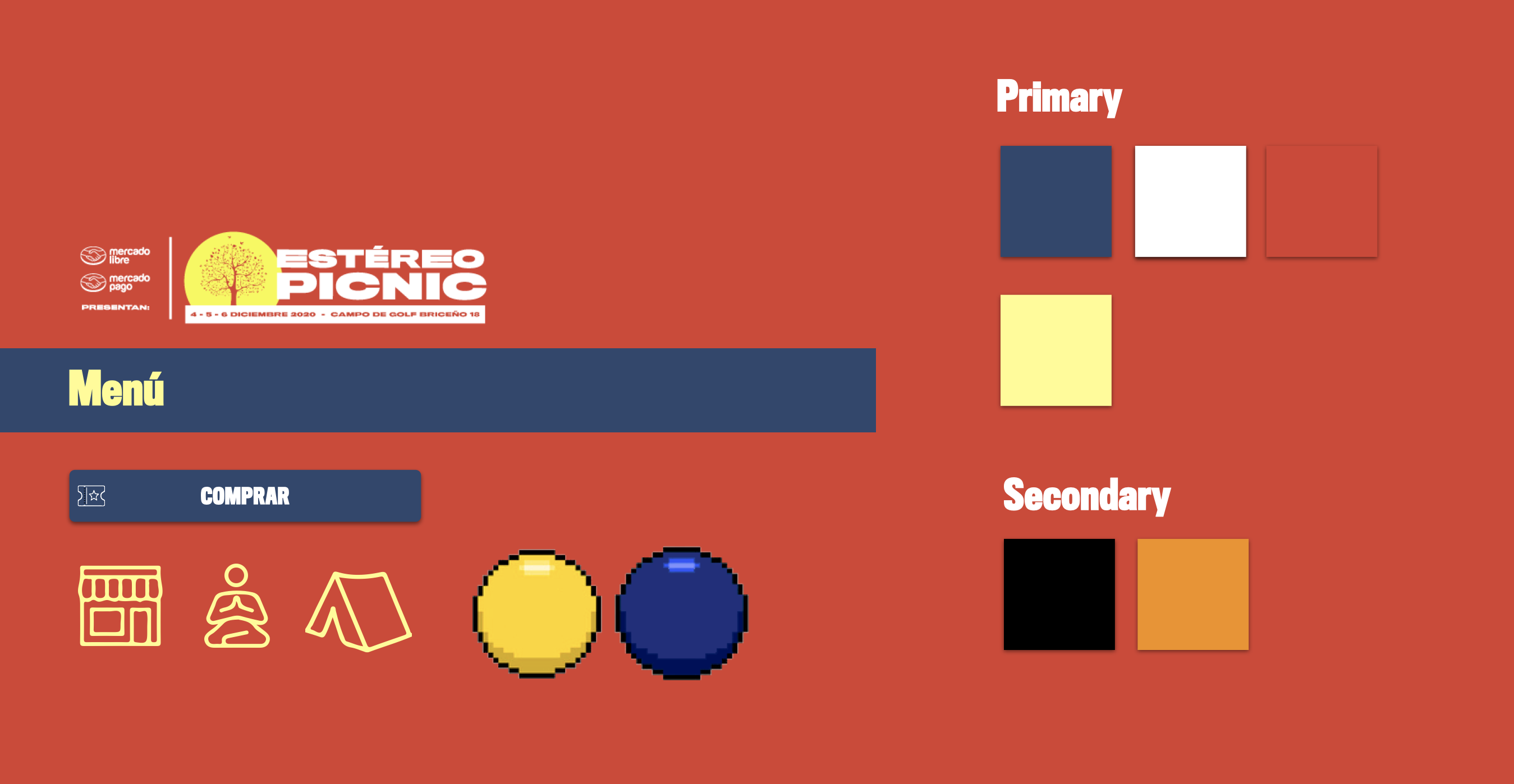
Based on this, for both of the solutions the style tile used for the final prototype was:
The first page (that will be used during the main digital event), is in pixel art due that I wanted to bring back the memories related to old videogames and also because this festival experience supposed to be a field outside the capital.
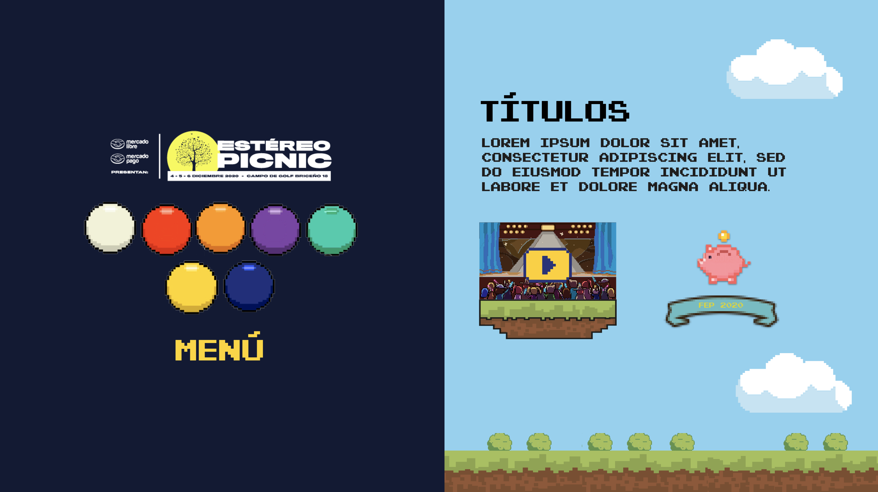
The page that will be used after the main event which continues to promote the event in December mixes the style tile used in the current official web page plus the pixel art from the online event, so the user won’t a big difference.
· · ·
Prototype
Low
I started first with the design of the Low-Fi prototypes in the phone, tablet, and at the end, with the computer, and because of this in this medium I will show you the prototype in different devices. All the detailed UI in the 3 layouts are in my Behance.
These are the main changes that were done in the prototype Low-fi to Mid-fi:
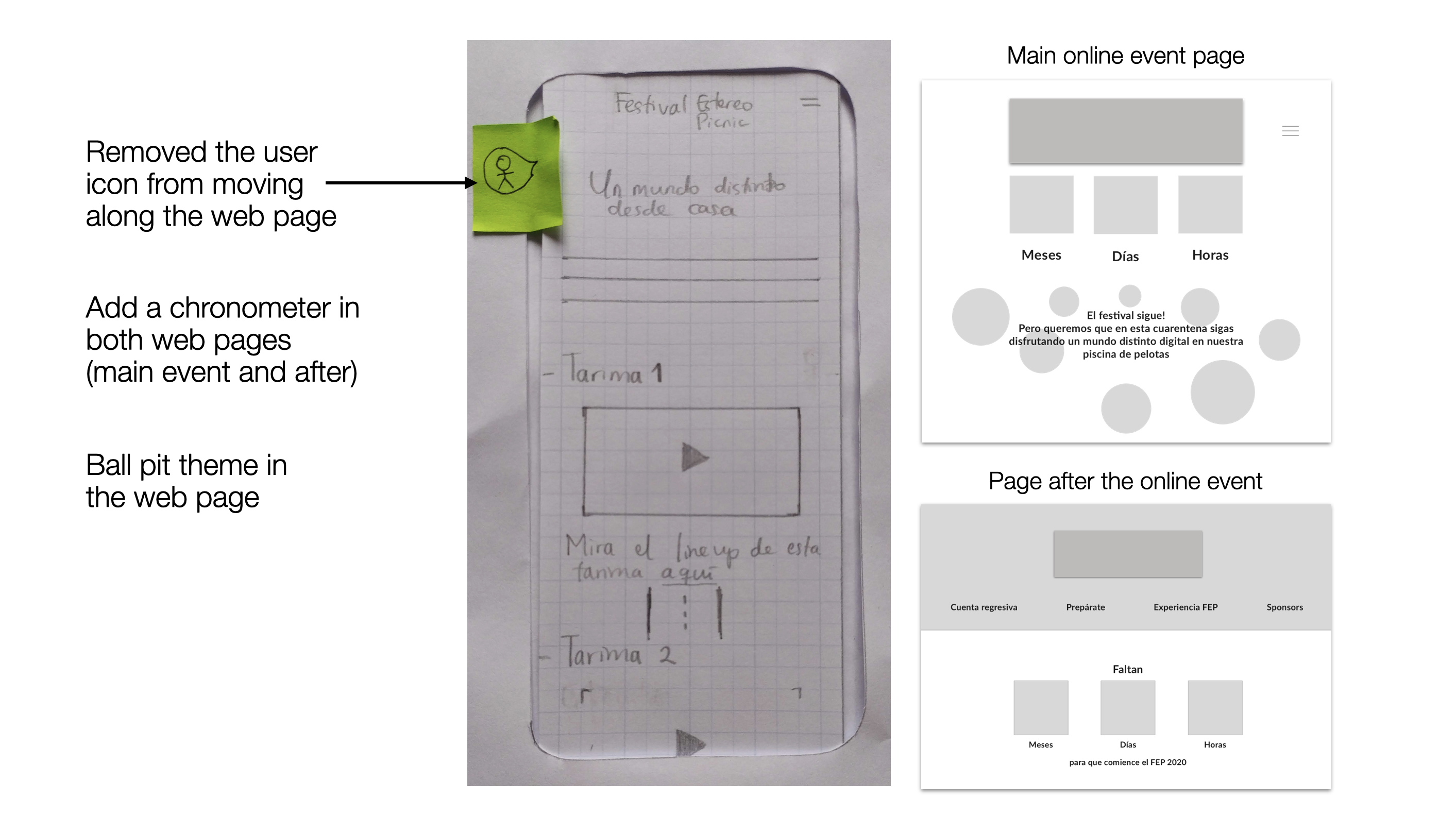
- Add the ball pool party concept (because without it there’s no festival).
- Reduce the stage information and moved it inside the stage.
- Changed the stage’s layout to be more like in a videogame.
Mid
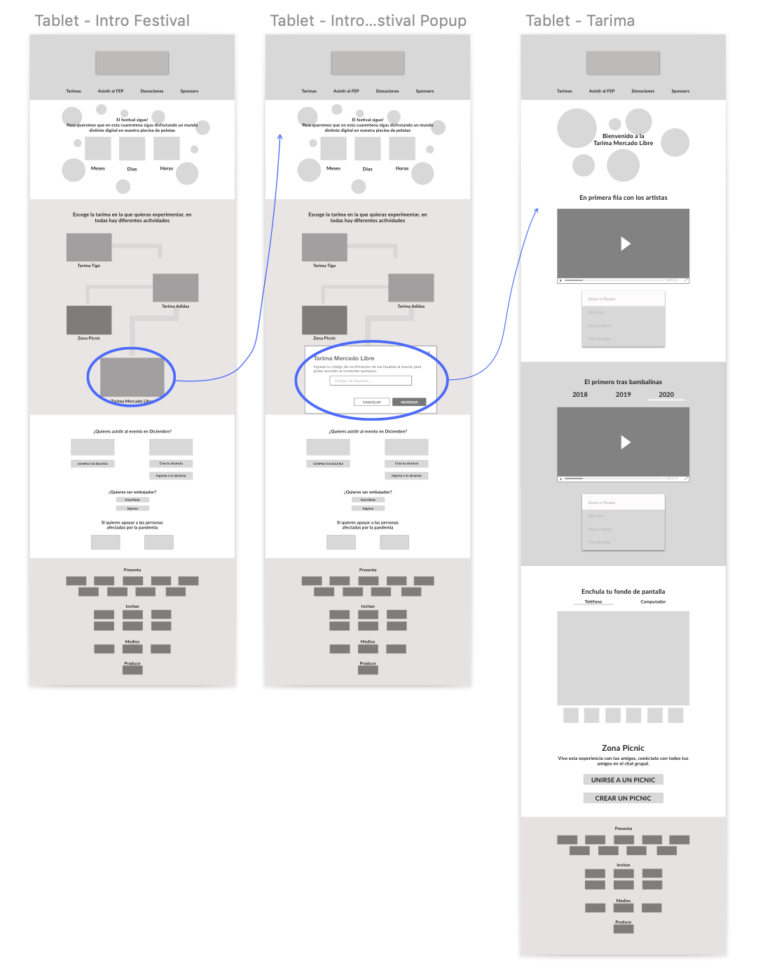
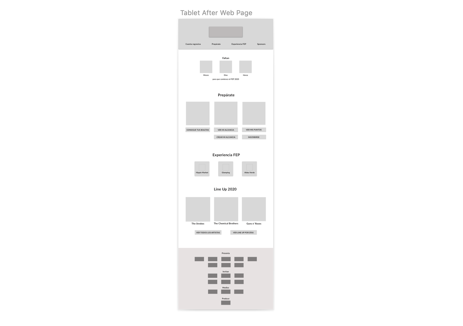
Mid wireframe of the main online event in tablet:
Mid- Flow of the page after the main event:
These are the main changes that were done in the prototype Mid-Fi to High-Fi:
- Changed the location of the chronometer: First the main introduction and under that there’s the chronometer. I changed it because it was confusing the objective of the chronometer.
- Moved the main logo to be lower: because it was too close to the top.
- On the page for the main online event, I changed the layout used inside the stages, and also added some tabs so the user can see exclusive videos from previous festival versions.
Hi-Fi
This is the final prototype of the main online event in the computer version, if you want to check better the UI, you can access the article in Behance
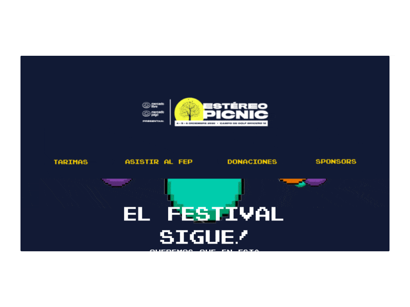
Access to the live prototype: Phone version for the website used for during the main event.
And this is the complete final version of the web page that will be used after the online event until the event in December:
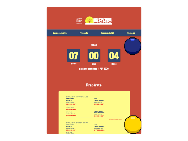
Access to the live prototype: Phone version for the website used for during the main event.
· · ·
Next Steps
- A Picnic zone adapted as a chill zone were people that purchased their tickets can talk with their friends while they watch any of the stages on the web page.
- Create an option/service where restaurants or sponsors can promote their brand so people can see their products.
· · ·
Learnings through the process
- One of the main learnings is that this strategy might work also to promote tickets to people that didn’t purchase it yet.
- After finishing the digital hi-fi prototype, I talked with some of the users that already purchased the tickets and they mentioned that is a good idea and that they might use it with their friends, the main issue is that if the festival is canceled they would ask for reimbursement because the price of the ticket covers more than simply this such as discounts on food, beers, and transportation. Also, some users suggested me to add more description of the features in the stages because they couldn’t understand the objective of some of these features.
If you want to create awesome things with tech and know about my projects contact me through LinkedIn
· · ·